
Introducing Advanced Exam Analytics with Custom Date Range Filtering

The Statistics/Reports page just got smarter. Admins can now set custom date ranges, export filtered data to Excel, and analyze platform trends with enhanced graph visualizations for Web, Mobile, and Combined attempts all in one place.
You’re in the middle of preparing your monthly performance review. You open the Statistics page… but it only shows data for the last 30 days. You need to compare August to October but that’s not even an option.
That’s when things get messy
You end up juggling multiple screenshots, spreadsheets, and filters just to piece the story together.
And even when you finally get the numbers… they don’t tell you much. The graphs look flat. There’s no clear way to compare Web vs. Mobile activity, or to spot patterns across subjects or topics.
Sound familiar?
That’s exactly what we fixed. The new Exam Review and Statistics/Reports Page updates bring powerful analytics, flexible filters, and a clean UI—so you can find real insights, faster.
What’s New
The Statistics/Reports page now includes three major upgrades designed to make analysis faster, clearer, and more customizable:
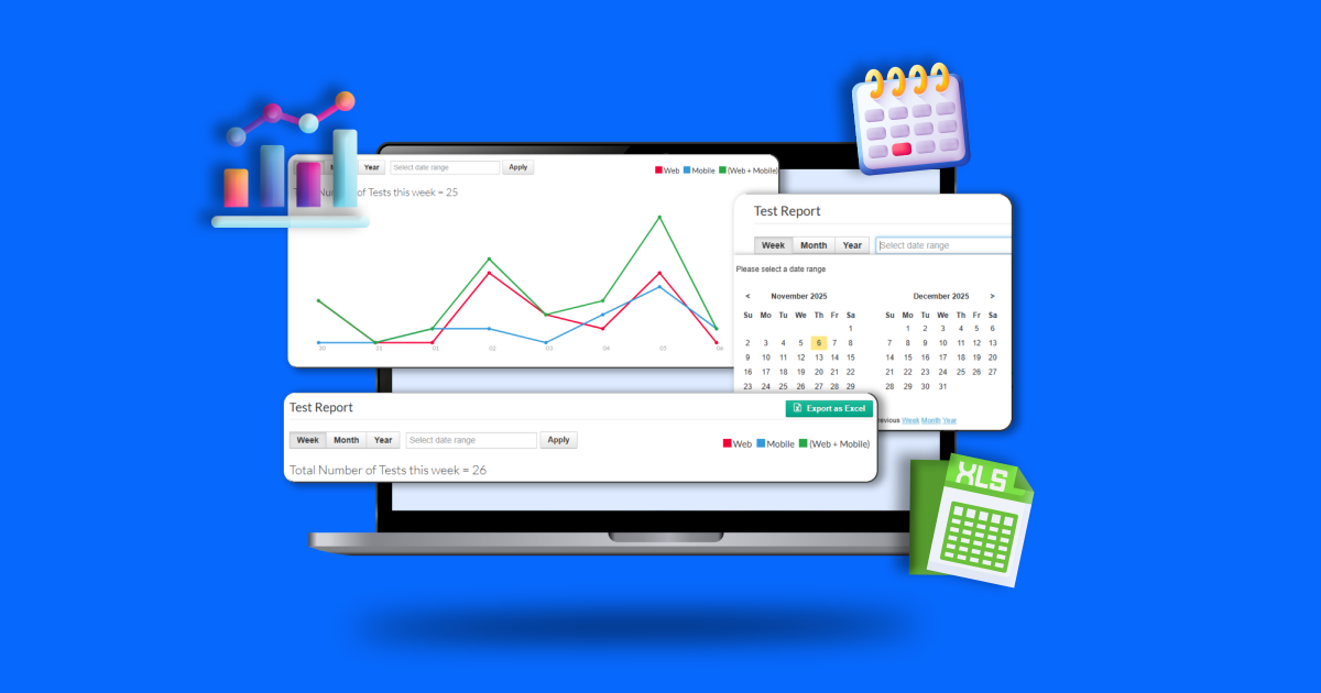
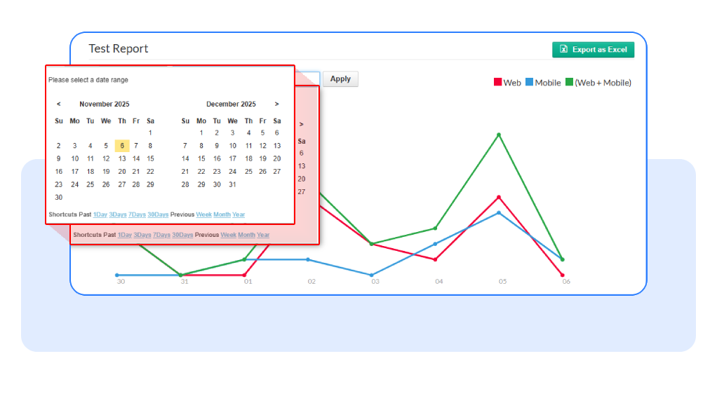
- Custom Date Range Selection: Choose any start and end date to focus on the period that matters to you. The graphs and tables refresh instantly based on your selected range no need to reload the page.
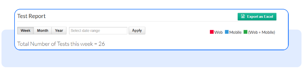
- Export to Excel (with Smart Naming): Download a clean, timestamped Excel file with all filtered data from the three tabs:
- Most Attempted Exams
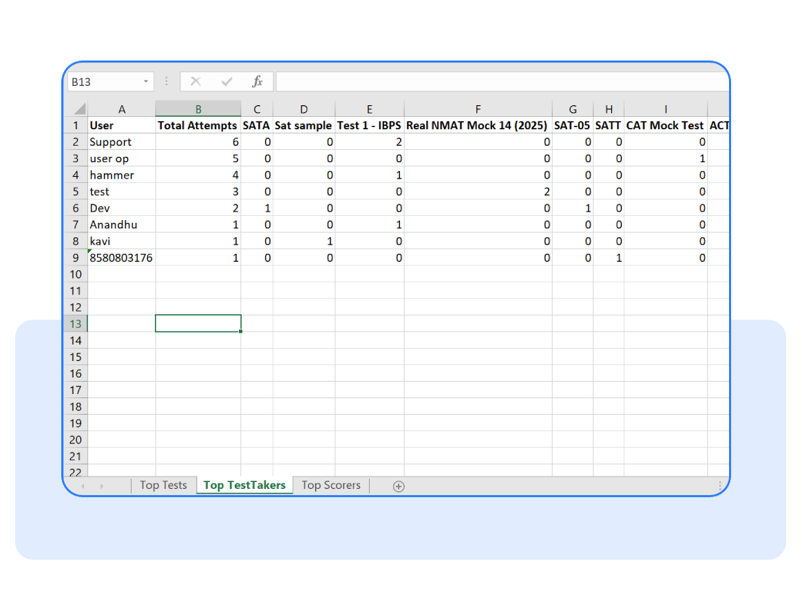
- Most Active Students
- Top Scored Students Each export includes your chosen date range in the filename (e.g., Export Test Report (2025-10-30 to 2025-11-06)), making file organization effortless.
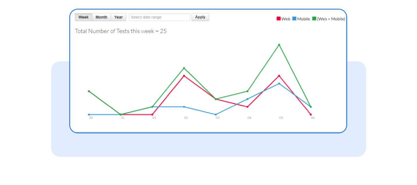
- Enhanced Graph Visualization: The new graphs show separate trend lines for Web Attempts, Mobile Attempts, and Combined Attempts, helping you see where students are most active and how performance differs by platform.
Why It Matters
Before this update, administrators were limited to just three preset date windows: 7, 30, or 365 days. Now, you can zero in on exact exam periods or compare performance trends over time on your terms.
Here’s what this means for you:
- More control: Analyze any period, from one day to an entire academic year.
- Faster insights: No more manual filtering or merging reports.
- Smarter decisions: See where your users engage most Web or Mobile and optimize accordingly.
- Seamless sharing: Export all your filtered data in one Excel file for quick presentations or audits.
You get a more flexible, data-driven view of student performance and exam engagement.
How it Works?
Getting started is simple. Here’s a quick walkthrough:
- Go to the Statistics/Reports Page
Navigate to the Statistics section, and you’ll find a Test Report dashboard that’s cleaner, and easier to explore
- Use the new Date Range Picker
Select any start and end dates. The tables and graphs will automatically refresh.
- Review the graphs
Each graph now shows three color-coded lines one for Web, one for Mobile, and one for Combined Attempts.

- Export your data
Click the Export to Excel button to download all three tabs’ data at once.
- Open and share your report
Your file will be ready to use complete with date range and timestamp in the title for easy tracking.
Frequently Asked Questions
Does the export include all three tabs?
Yes, all three Most Attempted Exams, Most Active Students, and Top Scored Students are bundled in one Excel file.
Can I still use the default ranges?
Absolutely. The page still defaults to the last 7 days, but you can expand or narrow the range anytime.
Will the graphs show combined data too?
Yes. Along with Web and Mobile trends, there’s a third line for Combined Attempts to give a holistic view.
Want to see your data the way you want it?
Log in and try the new Statistics/Reports Page today.
It’s flexible, visual, and built to make your reporting smarter than ever.
Have questions? Our team’s here to help - reach out to support.